Target (App)
The store in your pocket, and a registry beside it
A phone goes into the store with the shopper, which a website cannot do. Target's app is used at home to browse and order, and in the aisle to look up a price or find a shelf. The work shown here covers the shopping path in the main app and the first steps of Target's separate Gift Registry app.
A shopping app serves two situations that have little in common. On the sofa, the shopper wants to browse. In the aisle, they want one answer, quickly, with one hand. The app had to open ready for either. It also had to stay consistent with the website, so that a shopper who started on one could finish on the other without relearning anything.
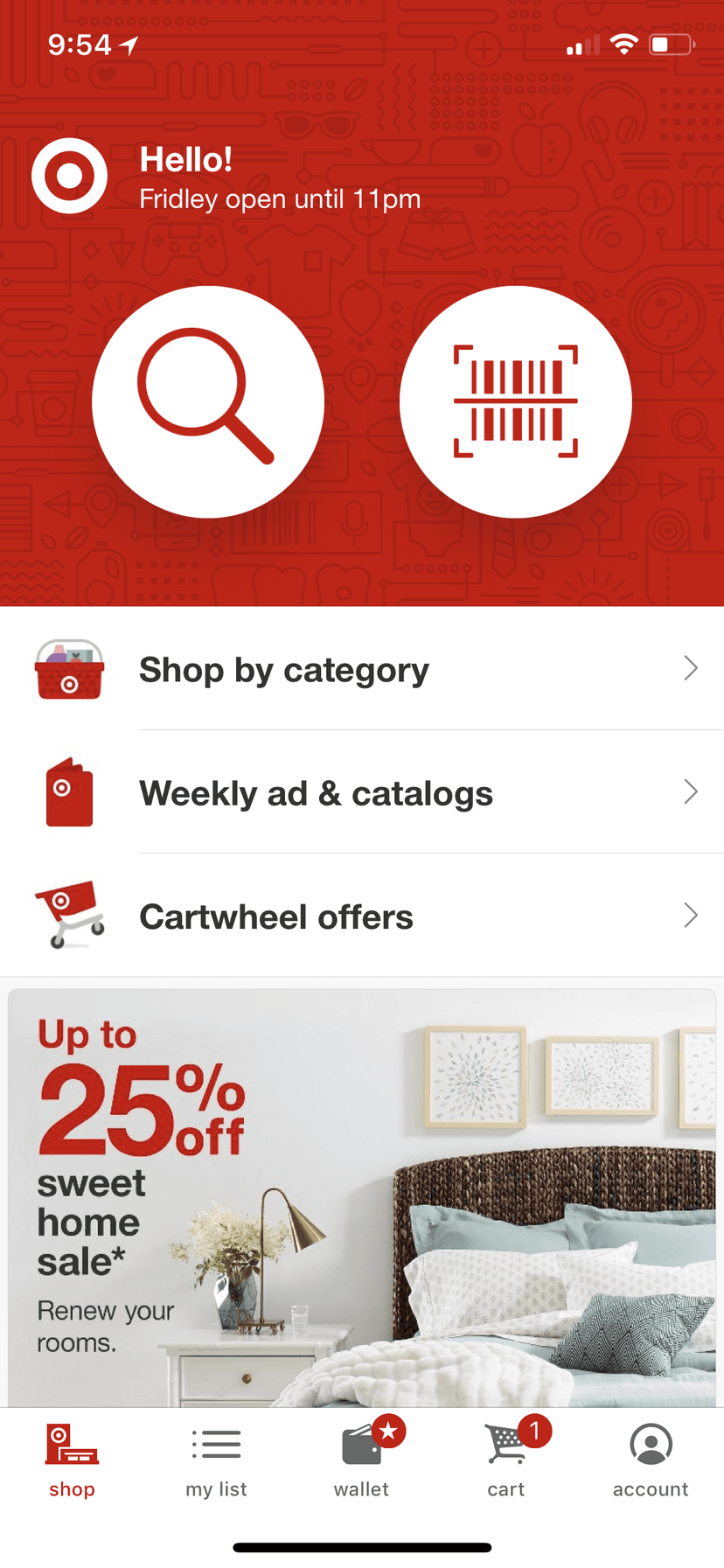
The app opens with two large buttons: search and scan. Everything else sits below them. The shopper's store is named in the greeting, with its closing time, and appears again wherever stock matters.
Browsing follows the same steps as the website, cut to fit a phone. Lists replace menus, a single switch replaces a filter panel, and the main action is fixed to the bottom of the screen, within reach of a thumb.
The registry app uses the same parts for a different task. It asks one question at a time and changes the button from buying to adding.
The home screen gives most of its space to two actions. Search serves the shopper at home. Scan serves the shopper in the aisle, holding a product. The greeting names the nearest store and when it closes.
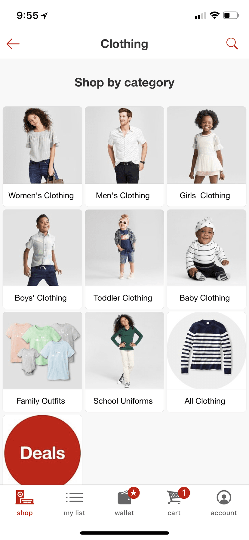
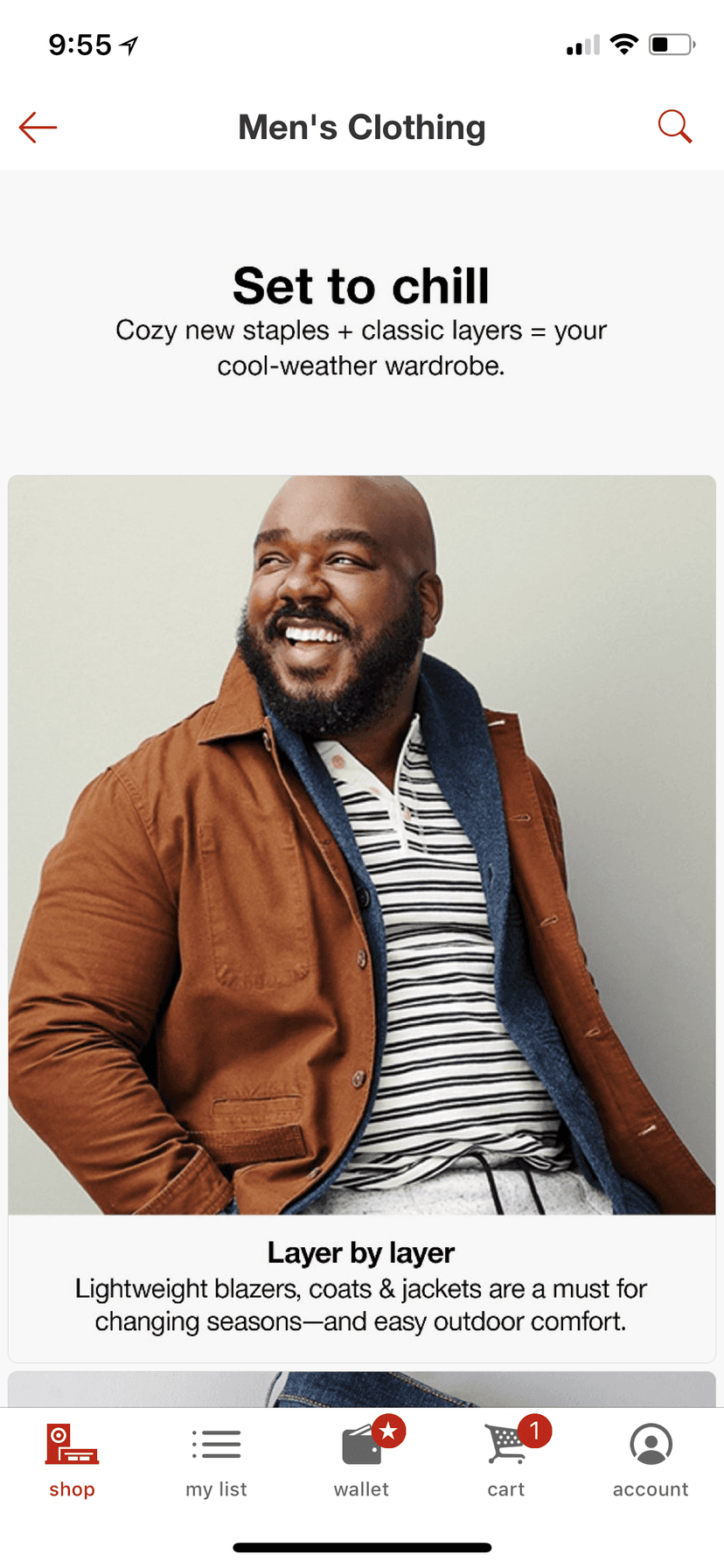
Departments are shown as a grid of photographs with a label under each. One level down, the page turns editorial, with the same seasonal story the website tells, set in a single column.
The website's filter panel becomes a single switch at the top of the list: in stock at my store. The result count sits beside it and changes as the switch does. Full filters remain one tap away.
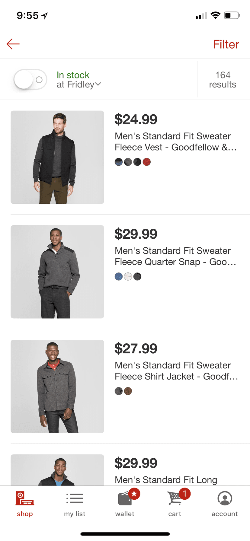
In stock, at the top
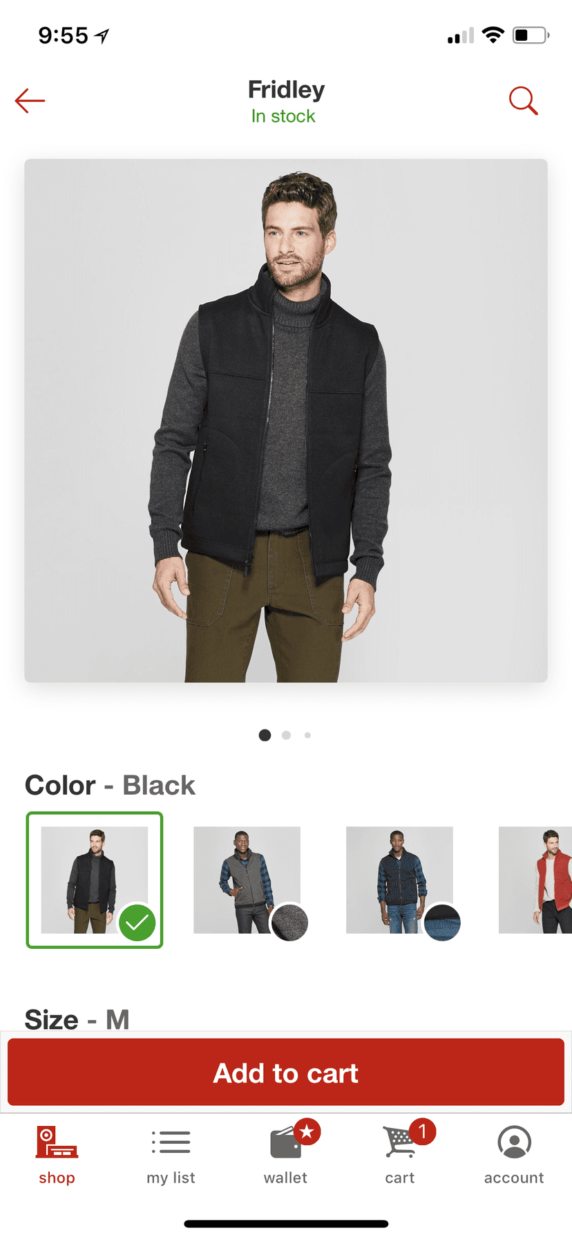
The product screen puts the store's name and stock status where a title would normally go. Colors are chosen by photograph. The add to cart button stays fixed above the tab bar as the shopper scrolls.
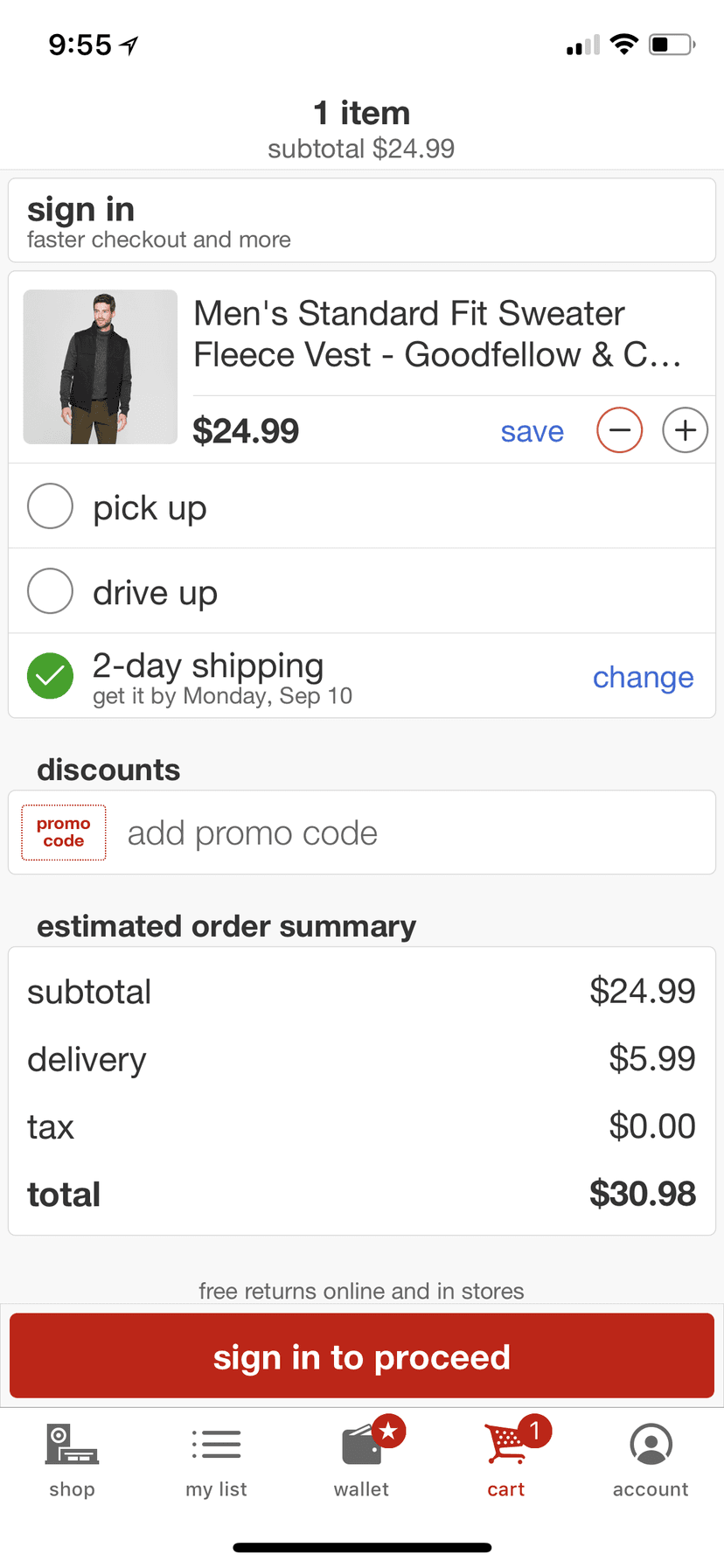
The cart lists each way to receive the order as a plain choice, with the date beside the one selected. The summary below adds it up before the shopper commits.
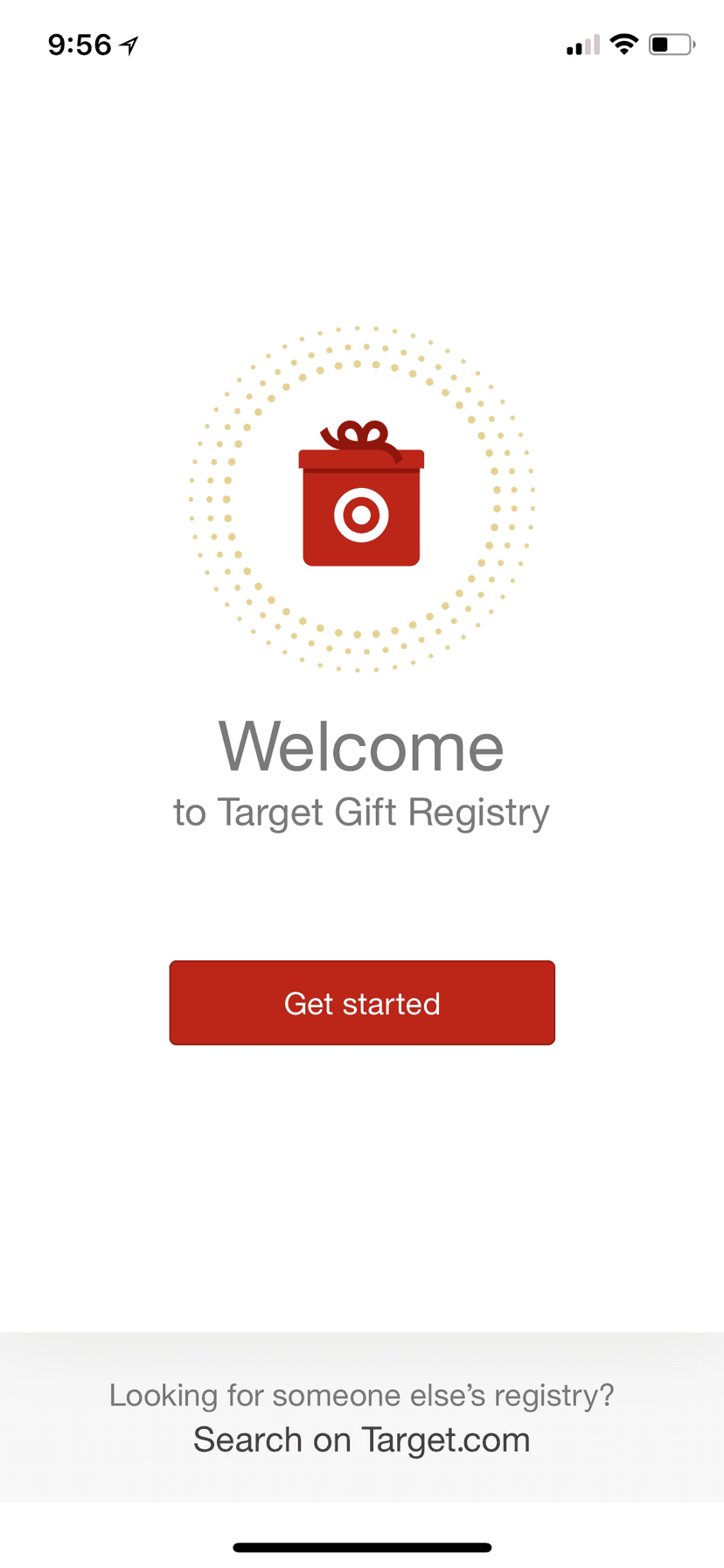
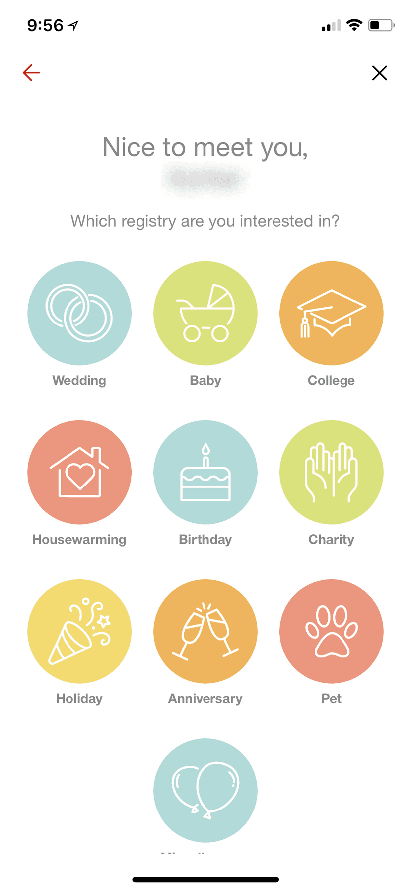
The Gift Registry app opens with a single button. The second screen asks only what the occasion is, with an icon for each: a wedding, a baby, a first apartment at college.
The registry's home takes its color and icon from the occasion chosen and suggests what other guests are adding. The item screen matches the shopping app, with one change: the button adds to the registry. Scan has its own tab, for walking the store and adding from the shelf.
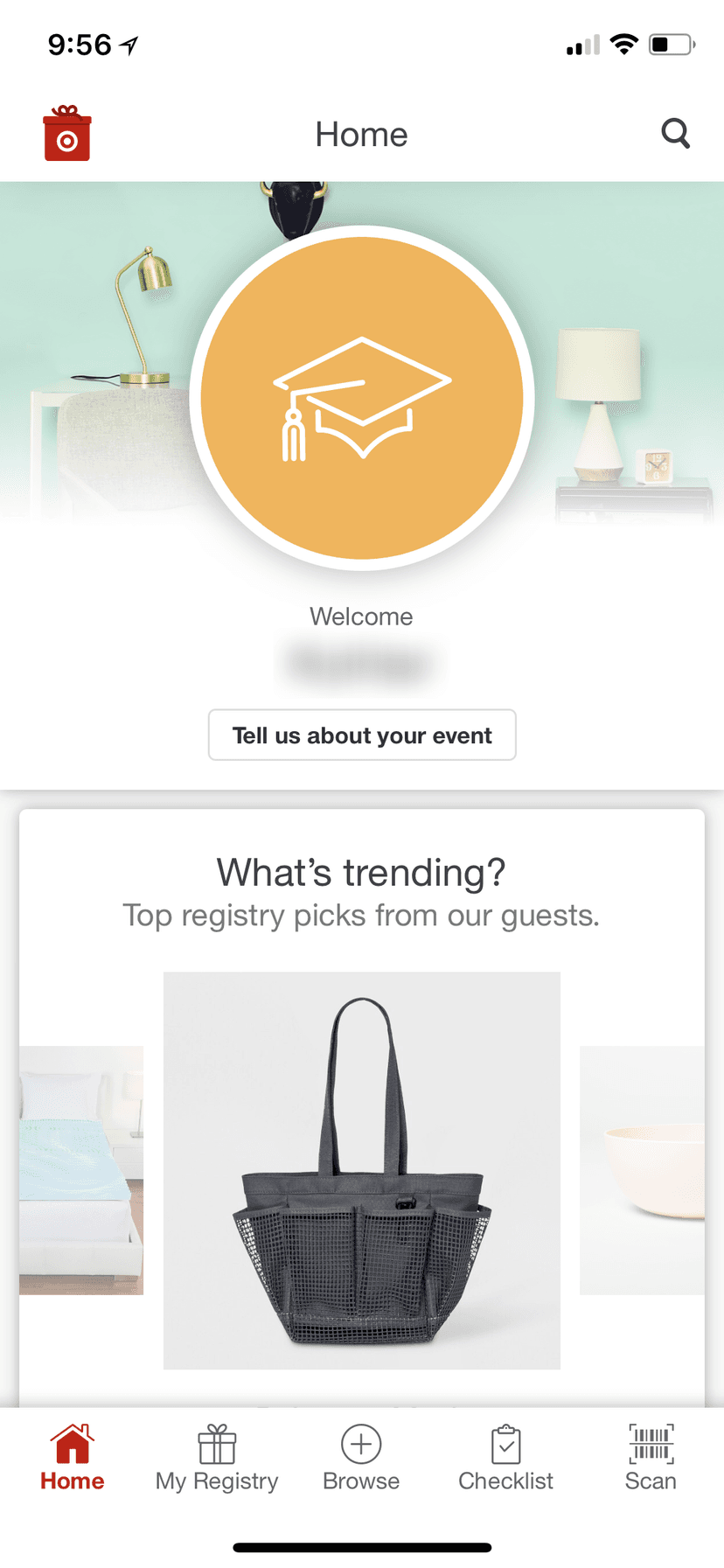
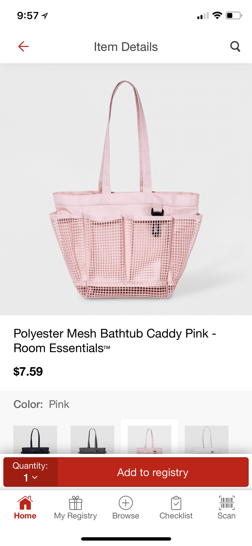
The two apps share one set of parts, so a shopper who knows either one can use the other.
Have a project in mind?
We take on a limited number of projects each quarter. Tell us what you're building.
Get in touch →