Hoonuit
A learning platform for educators, organized around three verbs
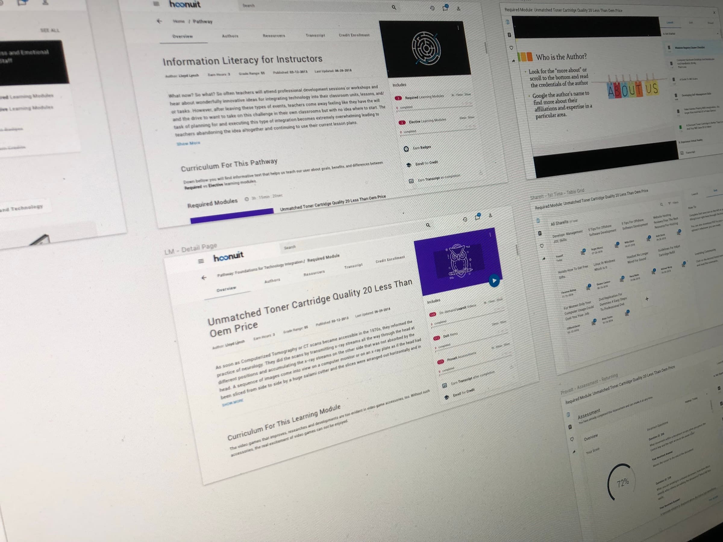
Hoonuit provides online professional development for educators. Teachers use it to build skills, earn credit hours, and collect the transcripts and badges their districts require. The content was already there: thousands of short videos, exercises, and assessments. Our work was the structure around it, on desktop and on a phone.
Teachers do professional development in the time left over, often in short sessions between other obligations. They need to know three things quickly: what is required of them, how long it will take, and what they will have to show for it. A large library makes those questions harder to answer. The platform had to tell a teacher exactly where they stood, at every level, without asking them to read a catalog.
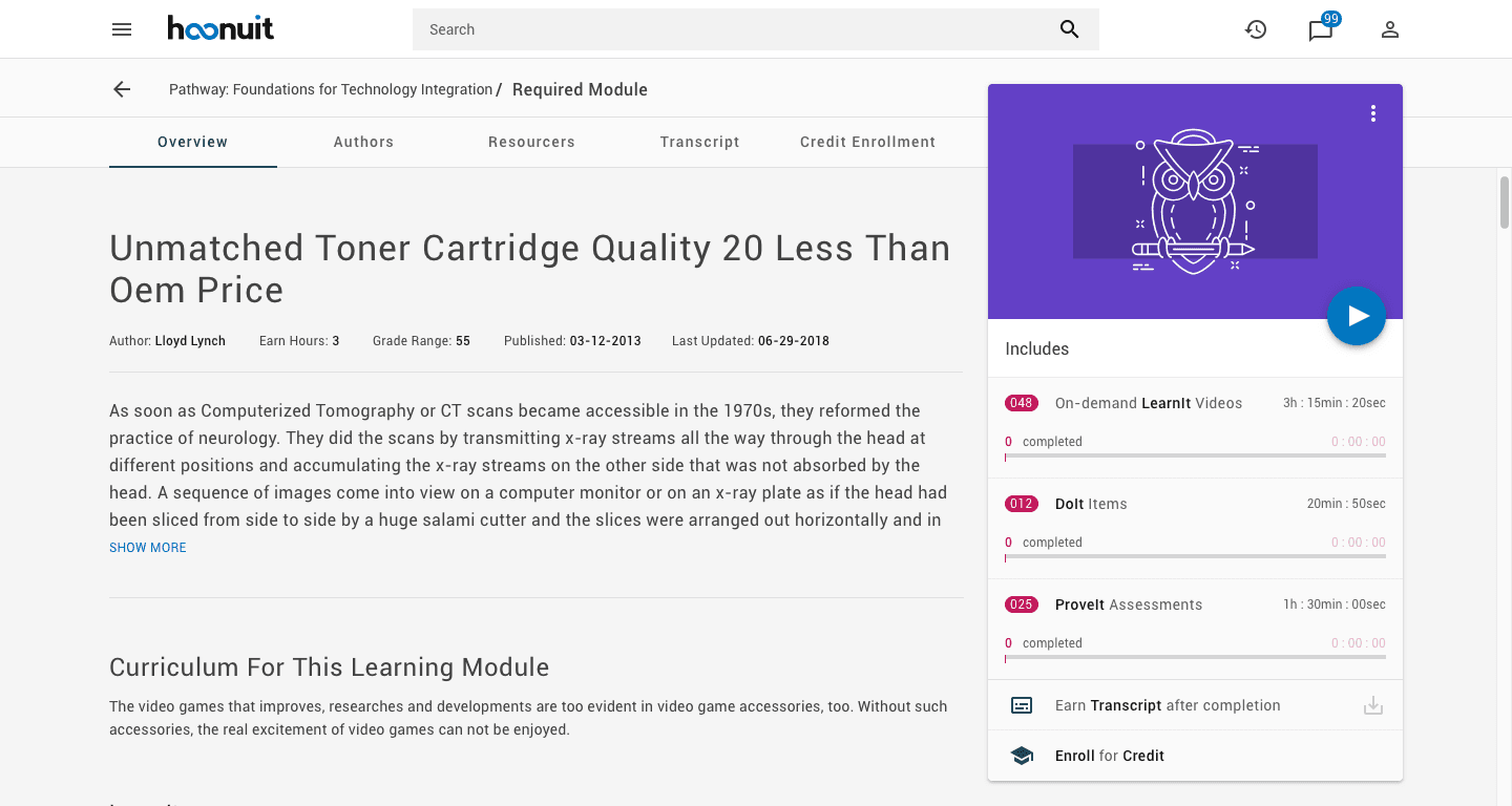
We gave the content three levels and gave each level the same shape. A pathway is a course of study. A learning module is one topic within it. Inside each module, the work is always divided the same way: LearnIt for video lessons, DoIt for practice, ProveIt for assessment.
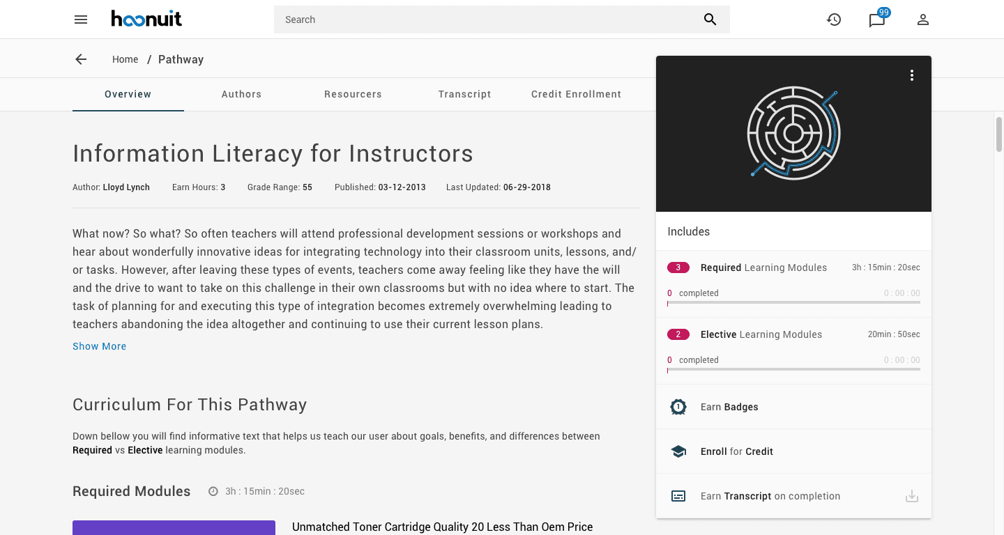
Every level carries the same summary card: what is included, how long it takes, how much is complete, and what it earns. A teacher who understands one page understands them all.
The interface is quiet. A single magenta badge marks counts, and blue marks the current selection and the next action.
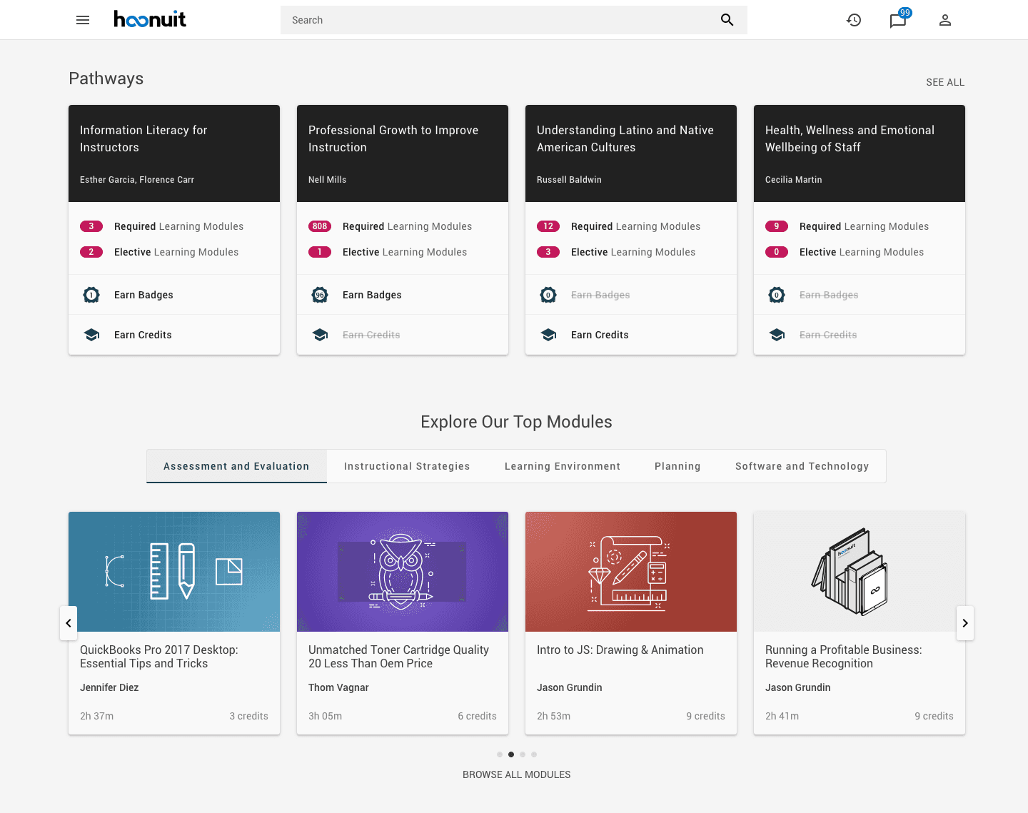
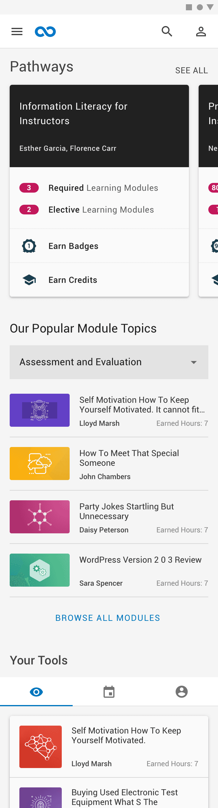
The dashboard opens with the teacher's pathways. Each card states how many modules are required, how many are elective, and whether the pathway earns badges or credits. Rewards a pathway does not offer are struck through, not hidden, so cards stay comparable. Top modules follow below, grouped by subject.
A pathway page pairs the description with a fixed summary card: required and elective modules, time for each, progress so far, and what completion earns. The curriculum is listed beneath, required modules first.
A learning module uses the same layout. The summary card now counts the three kinds of work inside it: LearnIt videos, DoIt items, and ProveIt assessments, each with its own time and progress.
LearnIt
Opening a module brings up the player. The video takes the left side, and the playlist stays open on the right, divided into chapters, with the length of every lesson shown. Three tabs across the top move between learning, doing, and proving without leaving the module.
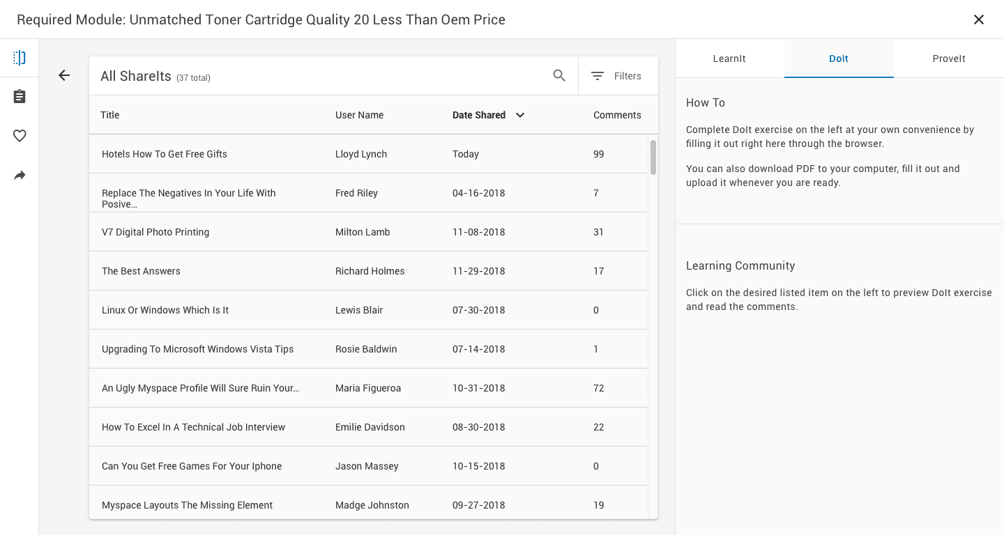
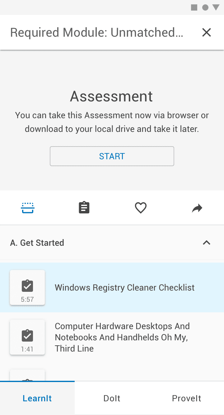
Practice exercises can be completed in the browser or downloaded and uploaded later. Work that teachers choose to share appears in a list, so the exercise becomes a way to see how colleagues approached the same task.
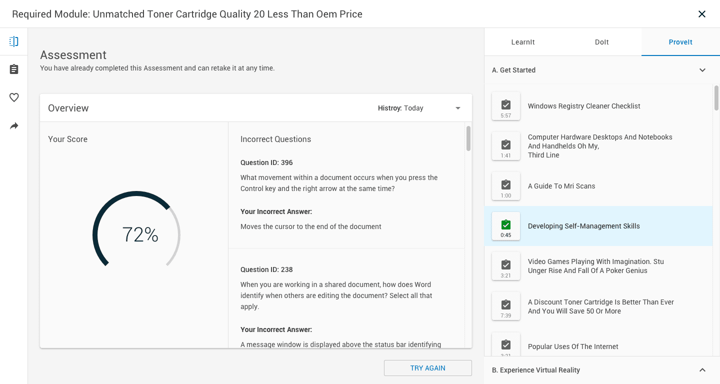
An assessment returns a score and, beside it, each question answered incorrectly with the answer that was given. Past attempts are kept, and the teacher can try again at any time.
The mobile layout keeps the same order and the same cards. Pathways scroll sideways, the subject tabs become a single menu, and the pathway page stacks its summary beneath the description.

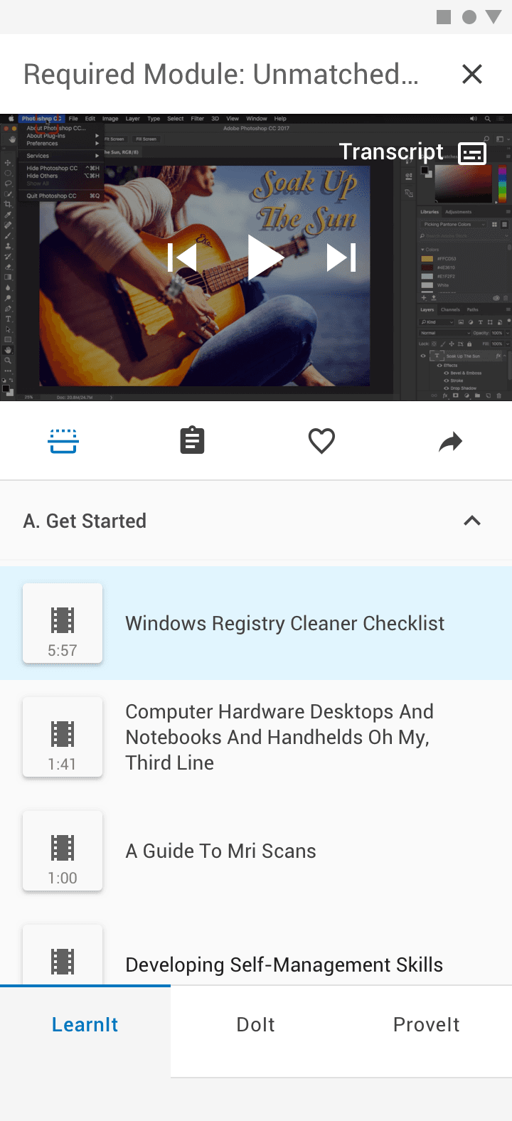
On a small screen the video moves to the top and the playlist runs beneath it. The three tabs move to the bottom edge, within reach of a thumb.
A teacher with twenty minutes can open the platform, see what is required, and finish one piece of it.
Have a project in mind?
We take on a limited number of projects each quarter. Tell us what you're building.
Get in touch →