Field Nation
Redesigning the work order, from first draft to final payment
Field Nation connects companies with independent technicians who install, repair, and maintain equipment on site. Everything on the platform passes through one object, the work order. A buyer writes it, a provider carries it out, and both must agree on what was done and what is owed. Over two years we redesigned that object and the tools around it.
A work order holds a great deal: scope, tasks, location, schedule, pay, expenses, documents, qualifications. A buyer posting a single job needs almost none of it. A buyer running a national rollout needs all of it, a hundred times over. The same screens had to serve both. Money made it harder. Every hour logged, expense added, or bonus earned changes the total, and buyer and provider each need to see that change and understand it.
We treated the work as six connected problems and solved them with one set of patterns.
Flightboard. See every work order by stage, and review finished work without leaving the list.
Modular work order. Start simple, and switch on complexity only when the job requires it.
Flexible scheduling. Describe when the work can happen in the buyer's own terms.
Centralized pay. One pay card, used everywhere money appears, read the same way by buyer and provider.
Auto-approval. Let routine work approve itself, under rules the buyer sets.
Recruitment. Map how buyers find and qualify providers before any screen is drawn.
The components are shared across all six: a summary rail that doubles as navigation, collapsible sections with their totals in the header, dotted rows for figures, and toggles for anything optional.
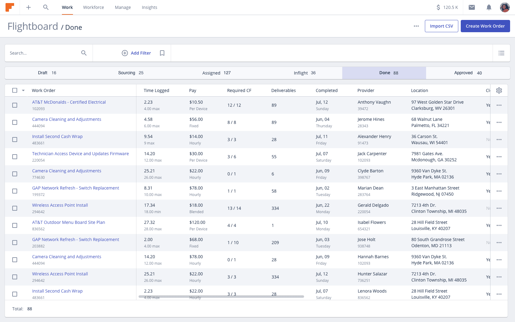
The Flightboard arranges every work order by stage, from draft to approved, with a count at each step. Columns change with the stage. In Done, the table shows what a reviewer needs: time logged against the maximum, pay, required fields, and deliverables.
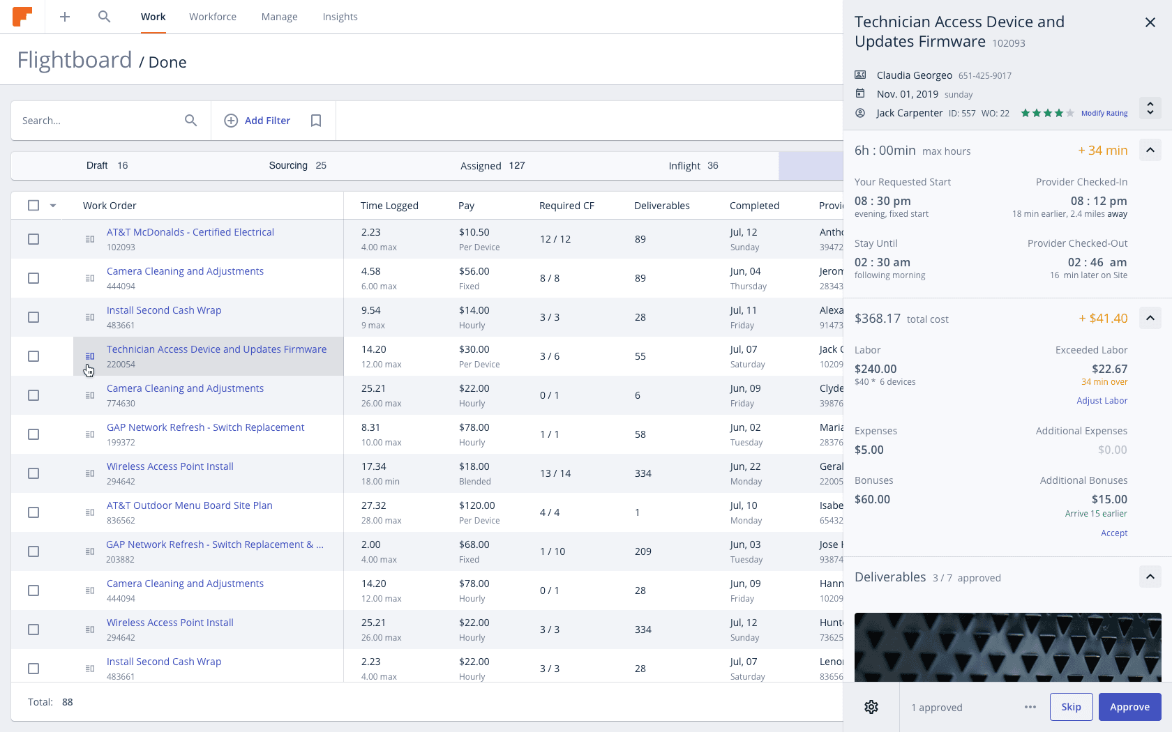
Selecting a row opens the work order beside the table. Requested and actual times sit side by side, with any difference shown in plain figures: 34 minutes over, $41.40 more. The buyer can adjust, accept, approve, or skip to the next one.
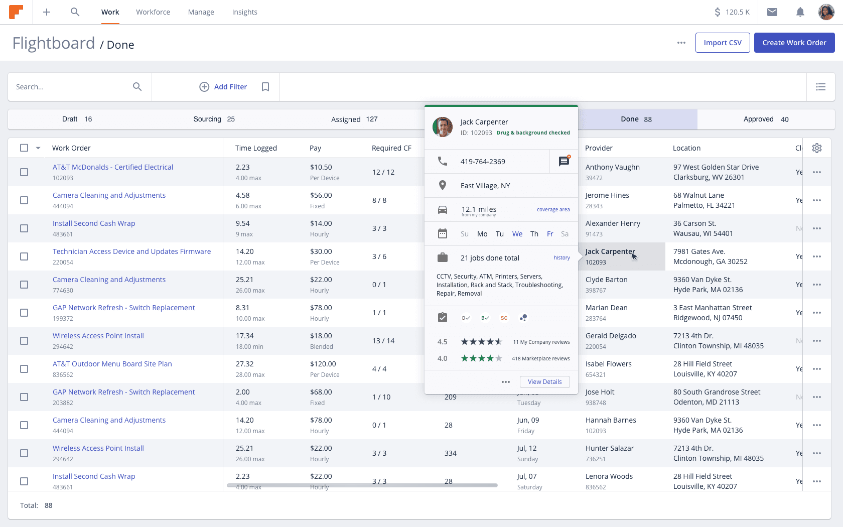
A provider's name opens a compact profile: distance, availability, jobs completed, skills, screening status, and ratings from the buyer's own company and from the marketplace.
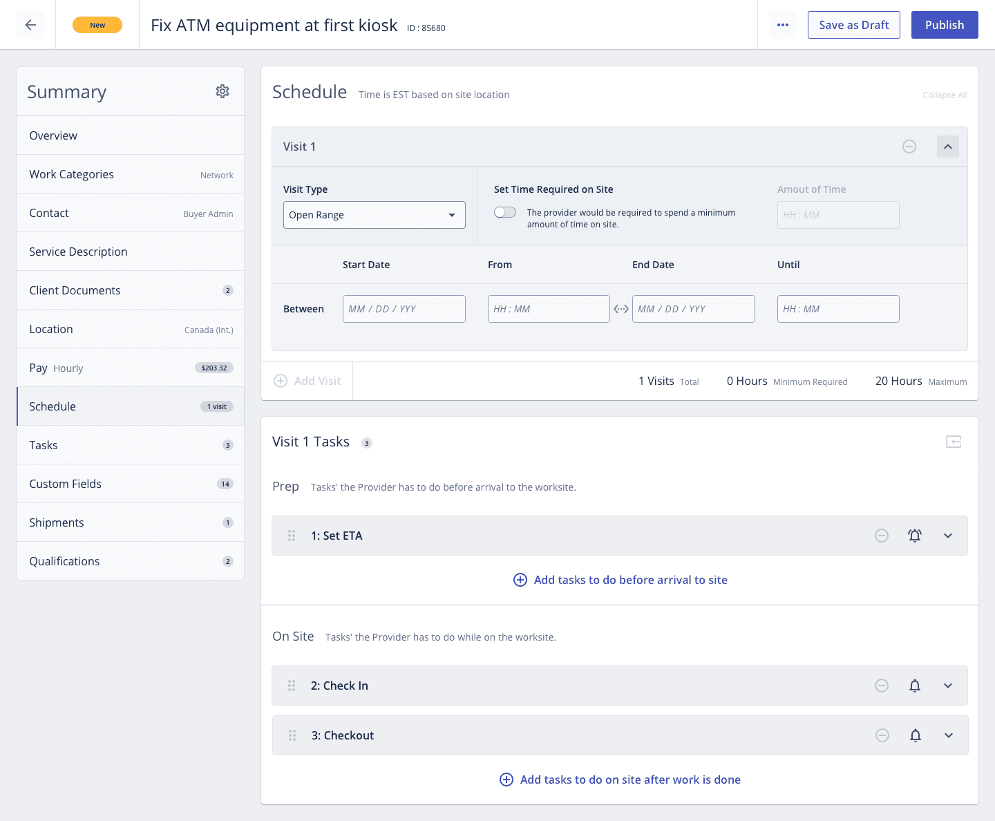
A new work order opens in its simplest form, with only the sections every job needs. One switch reveals the advanced features, and each optional section has its own toggle. The rail on the left lists every section and marks which are complete, so the buyer always knows what is left before publishing.
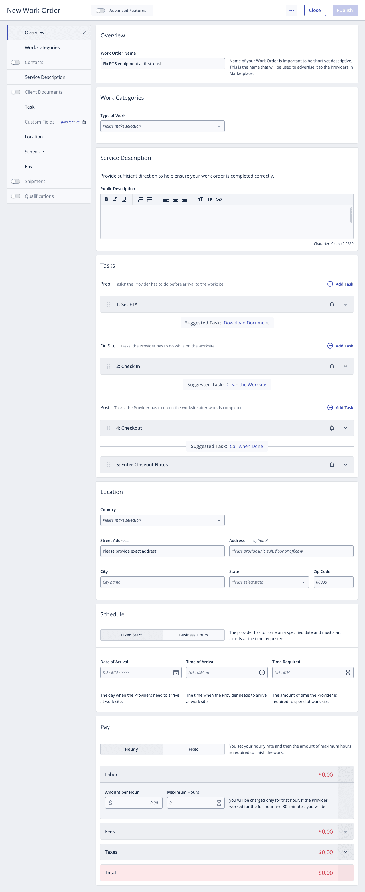
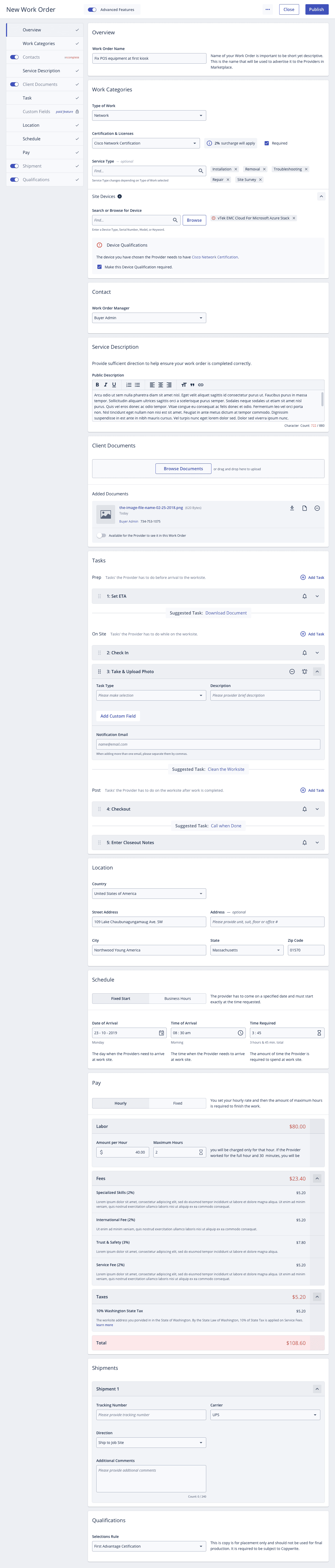
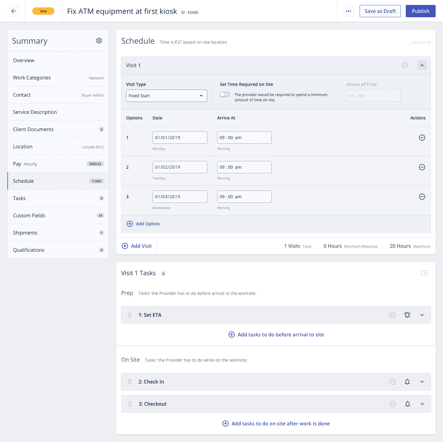
Site visits rarely fit one format. A buyer can offer several fixed start times, set a range of business hours, or leave an open window. Each visit carries its own tasks, grouped by when they happen: before arrival, on site, and after the work is done.
Pay in one place
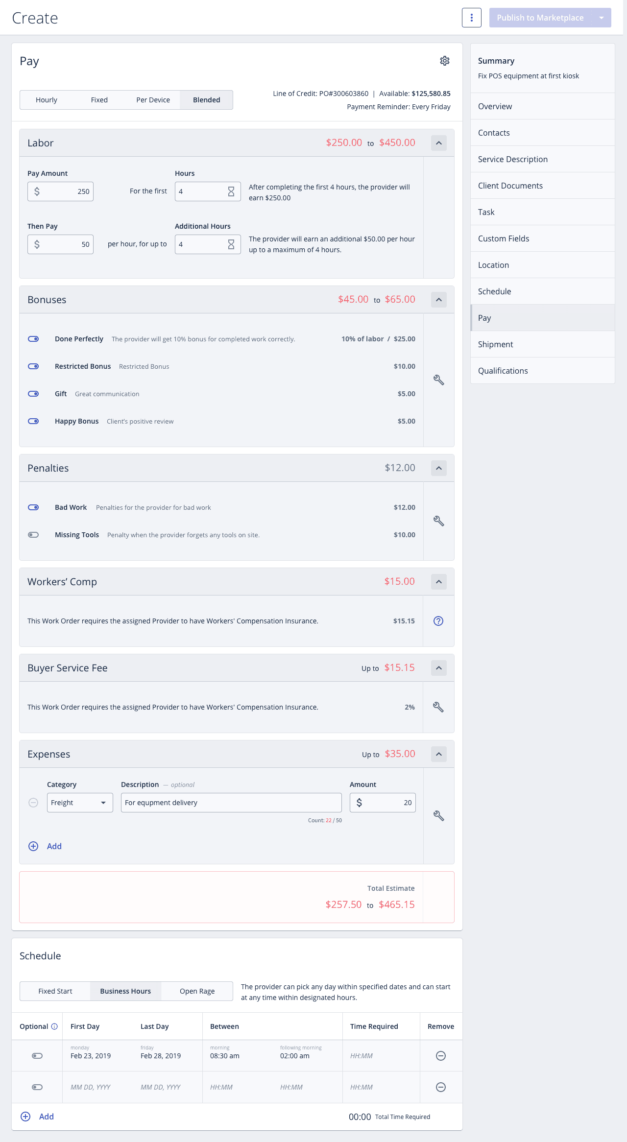
Pay had been spread across the product. We brought it into one card: labor, bonuses, penalties, insurance, fees, and expenses, each with its subtotal in the section header. The total is given as a range, because the final figure depends on what happens on site. The buyer sees the least and the most the job can cost before publishing it.
Expenses come from both sides and have to be approved one by one. The design was delivered as an annotated specification covering each state, each control, and the reasoning behind it.
Four pay types, two audiences, and five conditions, from hours under the limit to hours adjusted after the fact. The pay card was drawn in every combination so that buyer and provider always read the same numbers.
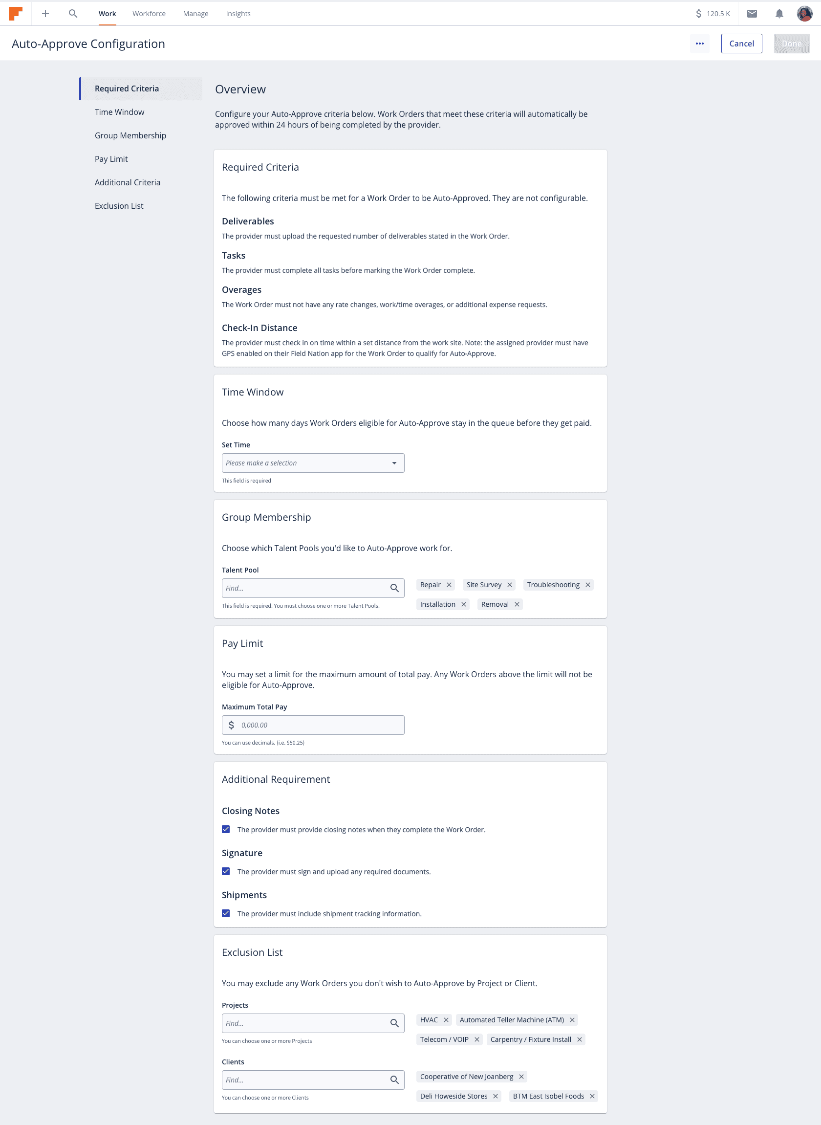
Most completed work needs no discussion. Auto-approve lets a buyer define what routine means: which talent pools, what pay limit, which closing requirements, and which clients or projects are excluded. Work that meets the rules is approved without review. Everything else waits for a person.
Before any recruitment screens were designed, the workflow was mapped end to end: how a buyer defines requirements, how providers move through each step, and what the buyer can see along the way.
The work order still holds everything it did before. It now shows a buyer only what the job in front of them requires.
Have a project in mind?
We take on a limited number of projects each quarter. Tell us what you're building.
Get in touch →