LinkUp
Rebuilding the admin system behind a job search engine
LinkUp is a job search engine that takes its listings only from company websites. That keeps them current and free of duplicates, and it depends on a team that maintains thousands of scrapers and repairs them when a company's career site changes. This project redesigned the internal admin system that team works in every day.
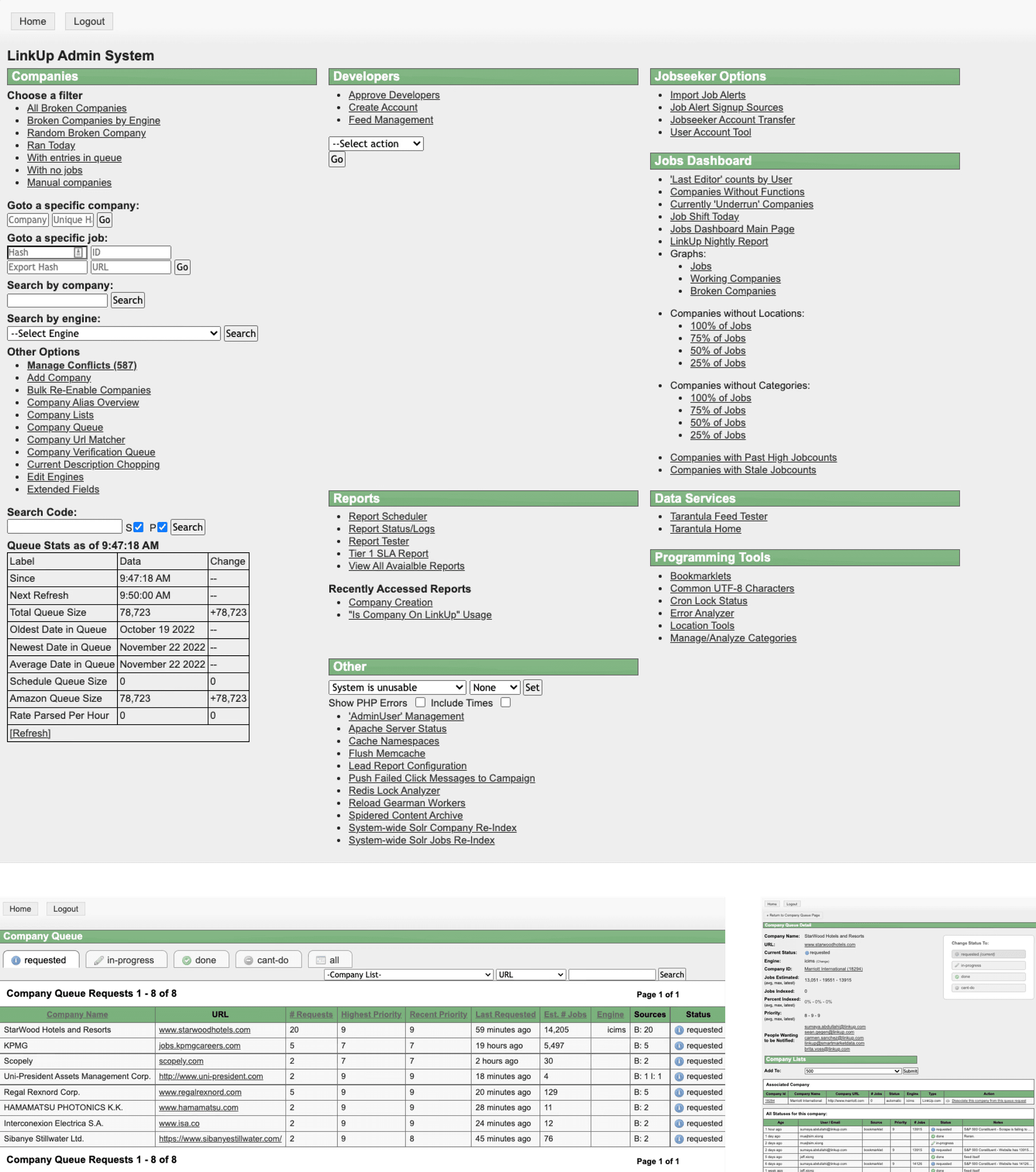
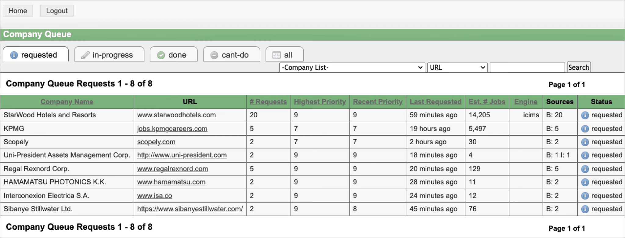
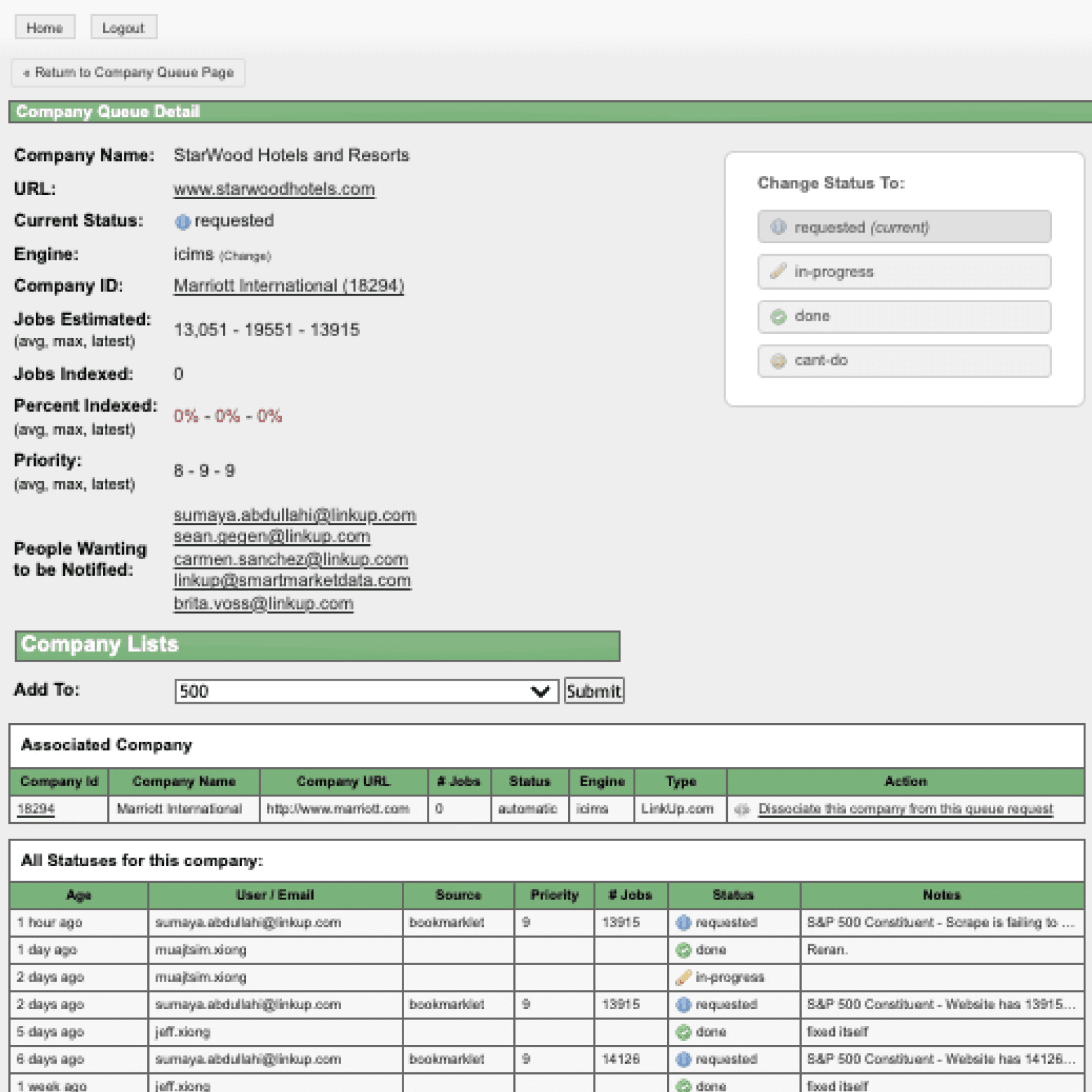
The existing system had grown one link at a time. Its home page was three columns of text links, with operational tools, reports, and server controls side by side. It offered little insight into the state of the queue. Users left the product and came back for small tasks, and had to open a record in full to check a single figure. Almost nothing on screen indicated what could be done next.
We interviewed daily users, subject matter experts, solution engineers, administrators, and power users. We walked through the scraper workflow step by step, from a request arriving in the queue to a repaired scrape, and recorded every screen and tool it passed through. We also reviewed how other job platforms structure similar tools, and listed what was missing.
The redesign follows the work. A request enters the queue, an analyst opens the entity, finds the failing scrape, fixes it, and moves to the next. Each step has a page, and each page keeps the next step in view.
Three decisions carry through all of it. Navigation and actions are explicit and labeled. A side panel holds insights and reference data, so checking a number no longer means leaving the page. And every screen is built from one component library, so a pattern learned once applies everywhere.
The interface is neutral by design. Color marks status and the primary action, and the data is left to stand out.
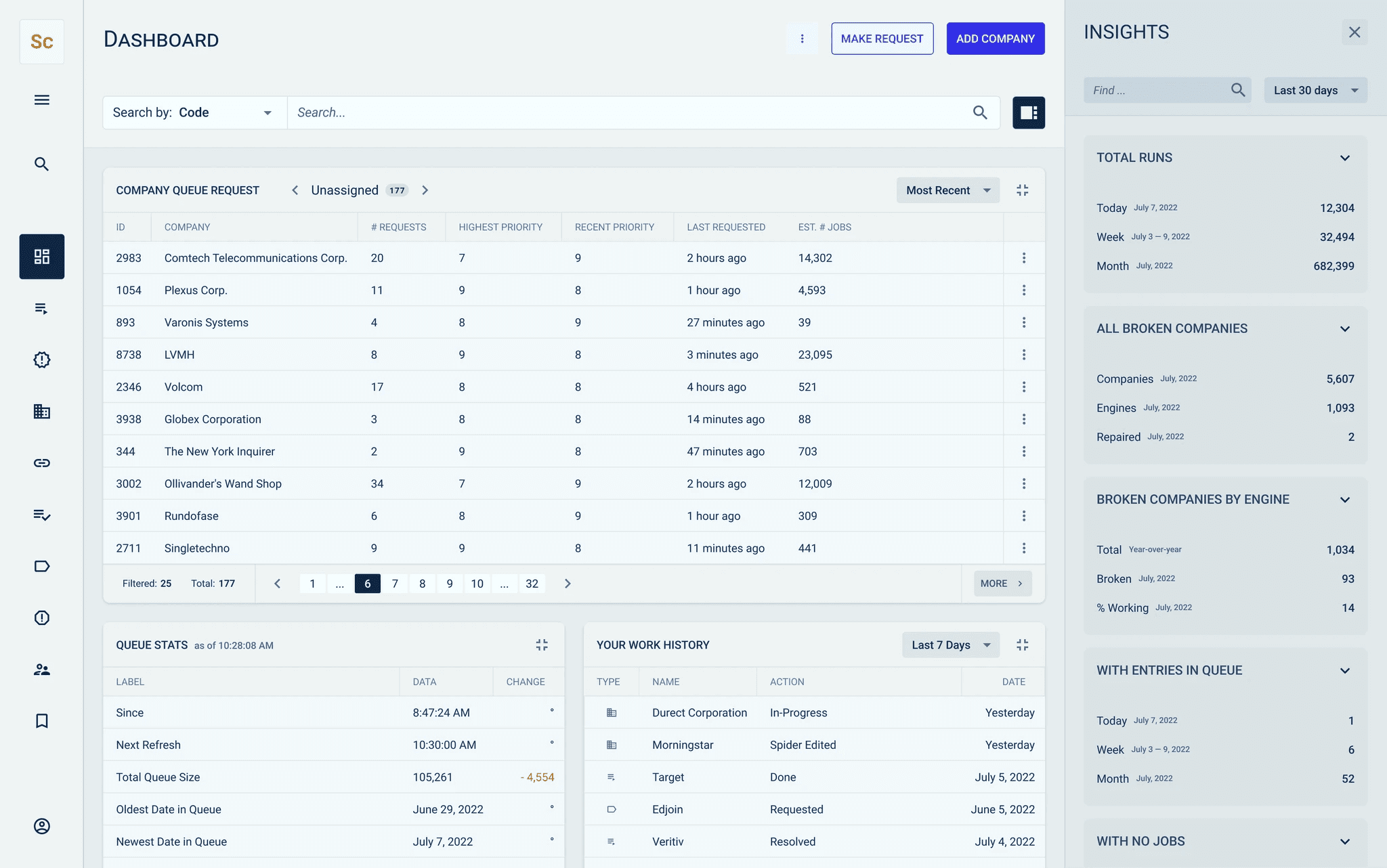
The new dashboard opens on the work itself: the request queue, sorted and paged, with queue statistics and the user's own recent history beneath it. An insights panel on the right holds the counts the team checks all day, such as total runs and broken companies, and can be closed when it is not needed.
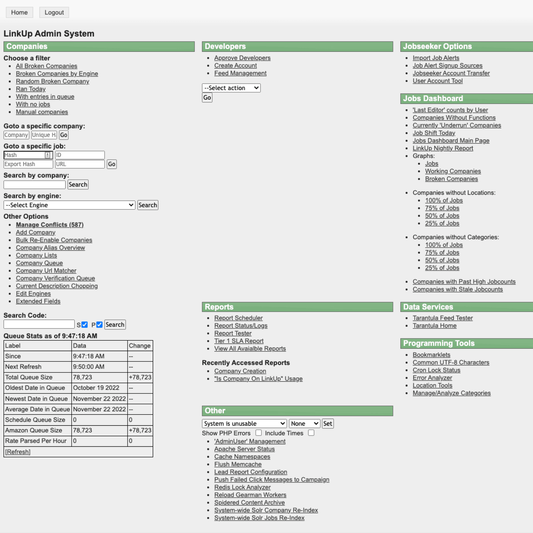
The research board traces the scraper's real path through the old system, screen by screen, with notes on where it stalled or left the product.
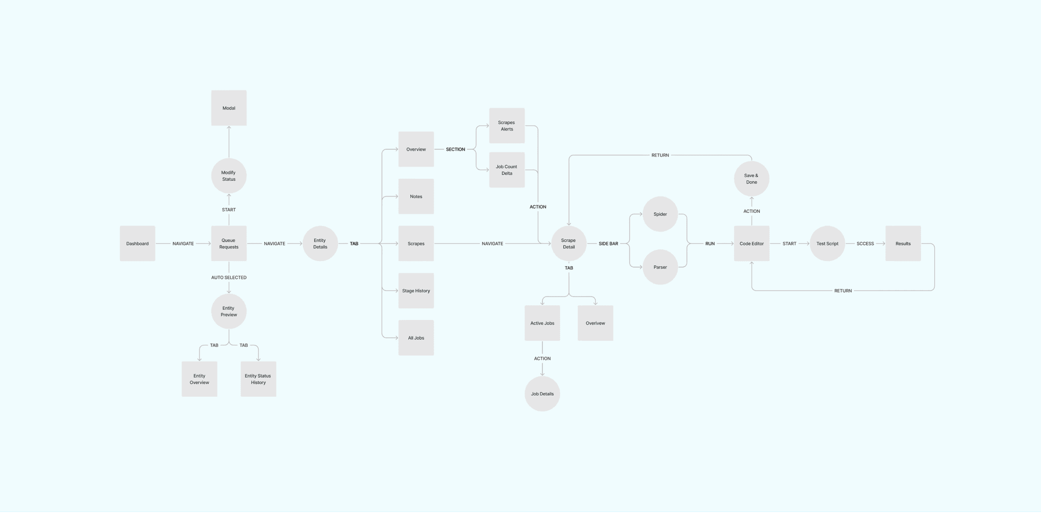
The redesigned journey runs in one line: dashboard, queue requests, entity details, scrape detail, code editor, test, results. Side branches cover the checks made along the way.
Queue requests
The queue is a split screen. The list stays on the left; the selected request opens on the right with its notes, job estimates, alerts, and tags. A status control at the top moves between requested, in progress, done, and the rest, each with its count. The company column stays fixed while the others scroll, so the analyst always knows which row they are reading.
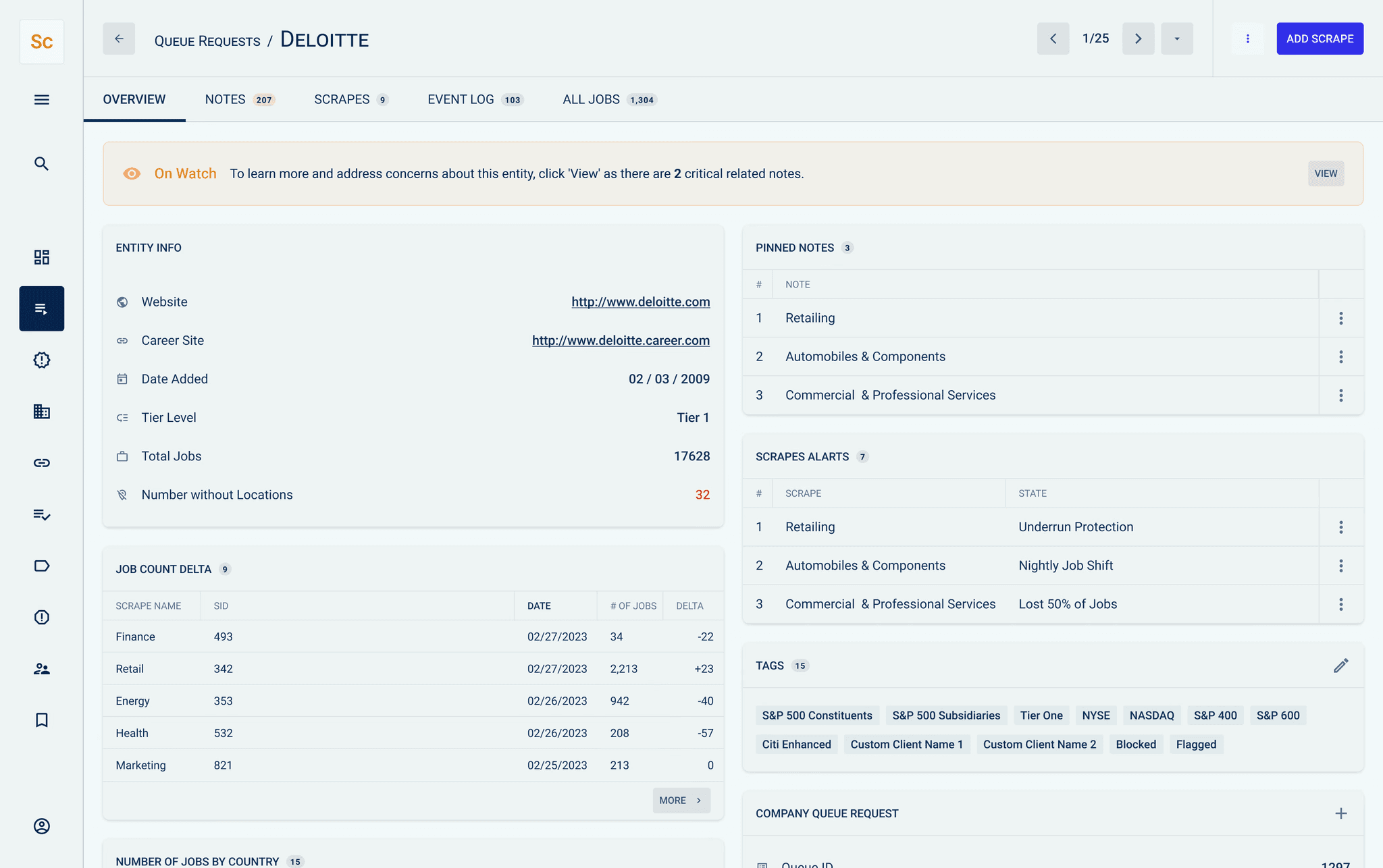
Everything known about a company is on one page, grouped into panels: entity information, changes in job count, pinned notes, scrape alerts, and tags. Tabs across the top load notes, scrapes, the event log, and all jobs in place. A banner at the top flags an entity that needs attention and links to the reason.
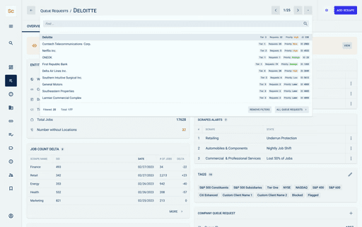
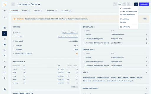
Two controls remove most of the back-and-forth. A search in the header jumps straight to another entity in the queue. An actions menu changes status, sends scrapes to the queue, or adds a note without leaving the page.
The components were designed in Figma and documented in Supernova, with the engineering team taking ownership of the library. It covers the foundations, such as inputs, tables, tabs, and alerts, and the patterns specific to this product, such as the queue request status item and the side panel.
The redesign covered the pages the team uses most, in the time available. The component library is what lets the rest of the system follow.
Have a project in mind?
We take on a limited number of projects each quarter. Tell us what you're building.
Get in touch →